Rebranding is an important process for every business or company when the internal workings of the company begin to shift, develop, and change.
After overcoming the challenges of the pandemic and the macroeconomic environment, TELOS has begun to make changes in many aspects of the company. The scale of personnel, the quality of services, and even the nature of each project have undergone positive changes.
As a branding agency, TELOS understands that it is time to reposition its own brand. As a statement of image and art, we have matured, and our services have improved in quality.

Small changes that affirm our maturity
1. Context
In July 2017, TELOS was founded with a solid foundation in professionalism and creativity. We started as a group of individuals who could support clients in brand design, website development, and creativity.
Over time, TELOS has matured and overcome challenges to develop and grow. Professionalism remains the core focus that creates value, but we have developed solutions and methods to work with clients as companions to solve problems.
In 2022, we proactively changed to create more value for our clients and fully utilize the potential of our creative team.
TELOS has redefined its perspectives on its products and solutions. Instead of simply creating design products, website programming, or ideation, TELOS is like a consulting professional, working alongside clients to identify problems and find solutions to brand issues.
2. Decision to reposition our artistry
Realizing that we have matured, we knew that we needed a new image and identity. So, starting from early 2022, alongside serving clients, the TELOS team began dedicating time to revamping our brand identity.
2.1. Maintaining our core – changing our tone
The focus of the brand identity restructuring process is still how to use art elements to declare to everyone that we are still us, but we have changed for the better.

TELOS’ logo remains the same and tells the same story, with only minor changes to signify a new chapter.
The TELOS of the past and the TELOS of now are still one, but we have entered a new chapter in our development story. We have a higher vision and a different positioning, but the core values and original values are still there: We are here to honor our clients’ core values.
2.2. Color
TELOS’ colors have provided excellent recognition since its inception. The colors and rules of appearance, complementing and contrasting with each other, have created TELOS’ brand identity value.
However, the color system is no longer suitable for a new personality. We have decided that the dominant color needs to be changed to create an overall sense of seriousness and greater spatial depth. 
The colors are still vibrant and colorful, but with increased depth.
The overall tone of the color palette has been shifted to a more serious, firm, and resonant feel, rather than the slightly youthful and soft tones of the old color palette. This color palette also prioritizes dark backgrounds and a sense of depth.
TELOS’ dominant color has been changed from purple to dark purple. The light purple has been transformed into an accent color. The most prominent highlight color has been changed from yellow to pink for its versatility on both light and dark backgrounds.
The team has also added a range of subtle gradient colors to create space for the design background.
2.3. Typography
TELOS’ old font system was Muli, a font that displayed information very well but still had a somewhat outdated feel. The team decided to switch to a more geometric, rounder, and modern font: Gilroy.
The new typography system of TELOS creates a fresher, higher quality, and more distinctive look.
The impact of the new font system is immediately noticeable in breaking away from the old style that the previous font set was unable to fully address.
2.4. Tone & Mood – Brand Feel
The combination of colors, rules of primary and secondary importance, and the role of color selection contribute greatly to creating the brand feeling. In addition, the font choice also conveys a non-verbal message about the character of the designs and the entire branding system.
The following is a clear demonstration of the importance of design choices in the brand repositioning process.
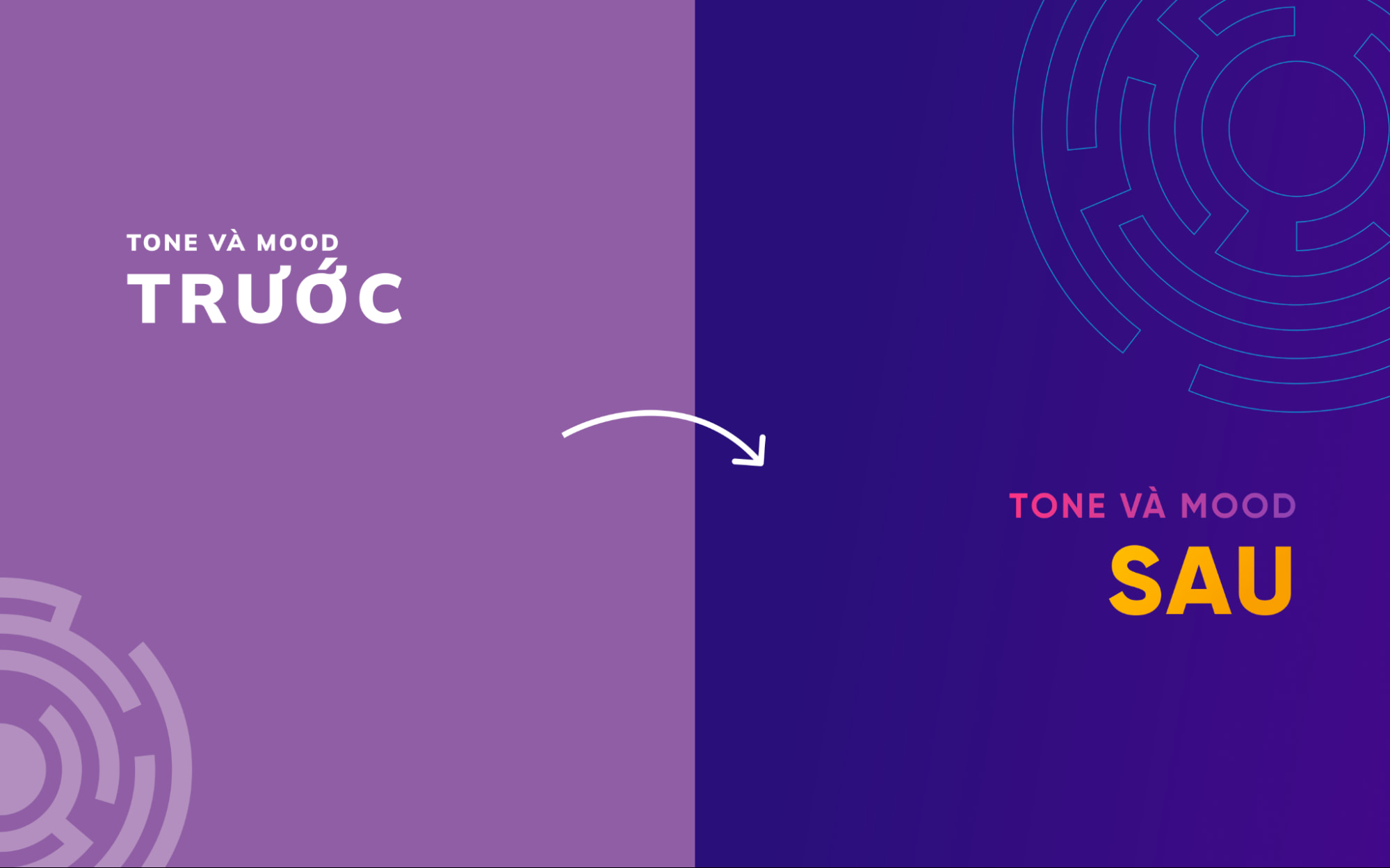
The changes in brand feeling before and after the TELOS rebranding process were significant.
Before the rebranding process, TELOS had a characteristic and personality, but it was not prominent and clear enough. The color system, font, and application were still too simple, leading to a safe and bland feeling.
After implementing the new system, the weaknesses have been addressed and emphasized. The choice and use of the background color still follows the old direction, but bolder to demonstrate a unit that is committed to choosing development directions. TELOS uses artistic language to convey a message about the transition.
2.5. Key Visual – Illustration direction
TELOS’ iconic images still revolve around the theme of European symbolism combined with a youthful and modern style and technology, as the core idea of the TELOS brand is still based on the teleology philosophy of the Greek philosopher Aristotle. However, to better fit the current artistic direction, the image processing and decorative elements will be calculated to be more suitable for the new display form.

Despite being based on the same source of ideas, the artistic language of the new Key Visual is clearer and more distinctive.
The modernity comes from the choice of approach of the Key Visual object, which is also more daring and youthful as the characters are ready to take selfies, create more dynamic and youthful poses to target the young audience. The elements are also more emotional, diverse and vivid in the direction of pop-art.
2.6. Bringing systemization into art
The diversity in services and sub-services also presents a challenge and an opportunity for the TELOS design team.
Instead of simply expressing designs through each Key Visual as artworks, the TELOS team decided to systemize the design rules and create new methods for these types of works.
These rules are detailed into guidelines, libraries, and the library itself is a resource for the TELOS design team.
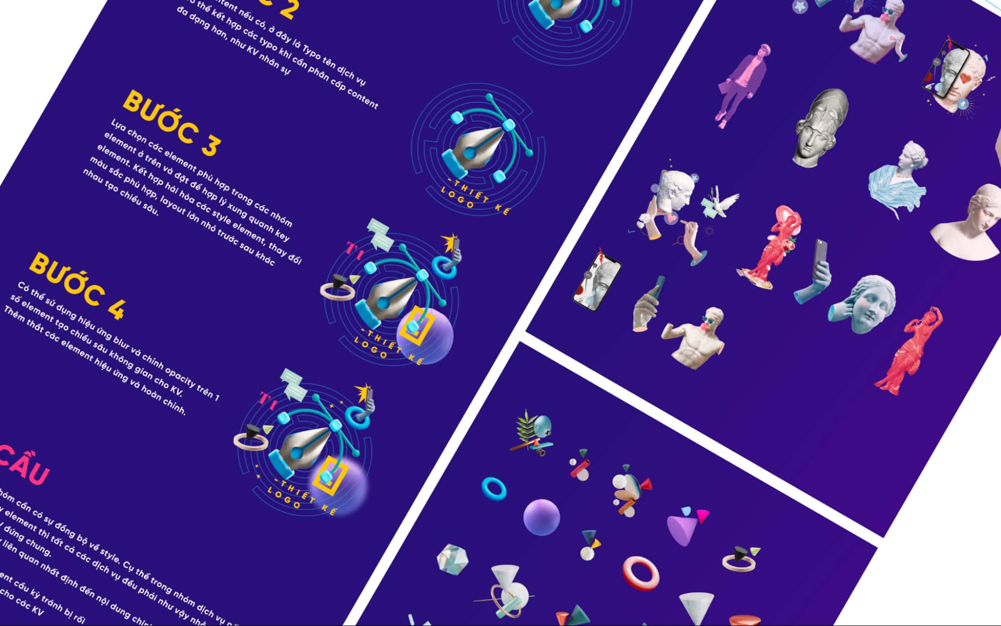
Standardizing the creative process is a way for art to be applied effectively.
The complexity and formation of each type of Key Visual will also be determined based on the level of the Key Visual in the system. For example, the Key Visual for introducing the company will be more complex and feature symbols, while the Key Visual for a sub-service such as landing page design will only feature service icons and appropriate decorative graphics.
2.7 Website
With clear direction and standards in art, developing design products becomes clearer and easier to distinguish right from wrong when executing design or creativity.
Although the website is complex in terms of content, structure, and many other aspects, it will also benefit greatly from the results of the rebranding process.
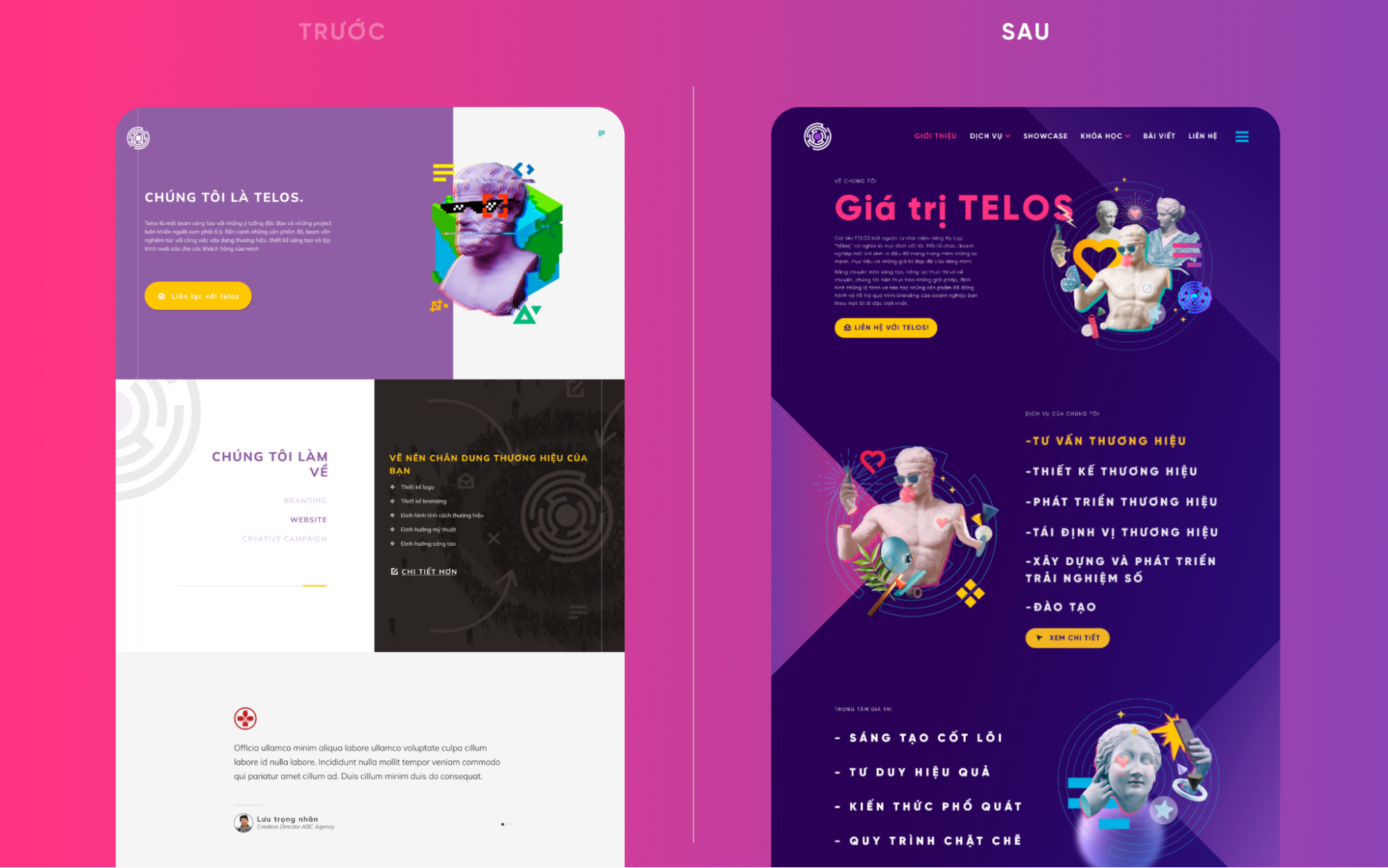
The difference in artistic design of the TELOS.vn website before and after the rebranding process is significant.
As a component of the brand identity system, the website not only conveys information but also leaves a brand impression on the subconscious of customers.
In addition, the new website has been restructured to contain more information. One of the most significant changes in the website this time is the branching of services, preparing a lot of information for each type of service to help users easily find and access the corresponding service according to their needs.
3. Repositioning the essence of services
Repositioning a brand does not necessarily involve changing products or services. In many cases, repositioning happens when a business feels the need to change its communication message or marketing strategies to target different audiences or tell a different story.
However, it is often seen that repositioning a brand requires a change in the structure of the products or services a business has, whether they are few or many. This can happen before or after the brand repositioning, and the changes may differ in degree, but they will all be consequences of each other.
In the case of TELOS, we have made significant changes in our services during this repositioning process. The result of this transformation is expected to change the way we solve problems for our customers and provide a more comprehensive set of solutions for the problems our customers face.
3.1. Restructuring service classifications
Before 2022, TELOS focused on providing services based on what the team could do, more accurately, based on the perspective of the executor.
We had Branding, website, creative communication project, and to some extent, a small service of designing mascots. These classifications came from the perspective of “what can the team do for customers?“

The list of TELOS services before and after repositioning
After changing our perspective, we realized that we could do more than what we had listed by combining the tools available to the execution team and the knowledge that can be deepened from the guiding people, or even farther, the resources of partners within and outside the Vân Tay Media ecosystem.
Therefore, thanks to that perspective, we created service packages from what we had, created value by combining available resources, and opened up more opportunities leading to one thing: solutions for customers.
3.2. Systematizing access levels
Now TELOS can provide a list of solutions to serve customers based on their needs, ranging from completely new system branding design, developing what they already have, or repositioning what they had. The changed perspective, repositioning, and approach method are based on providing solutions to customers’ problems instead of just providing what we have.
4. Summary
In general, the process of repositioning a brand will be a transformation process that involves not only the external appearance but also internal changes, whether they are few or many, to move towards a new direction with new stories and values.
We will serve our customers better in our development process
TELOS has undergone a smooth rebranding process and has successfully transformed its message through artistic language. Join us to implement a similar story for your brand when needed.
The article and images were compiled by TELOS


