0. The big picture of brand portrait
Designing a logo, or more broadly, creating a brand system for business units, organizations, or individuals, is a job that is not necessarily easy but not that difficult either. In reality, any process will develop based on a common backbone. Whether it’s drawing a logo for a neighborhood grocery store or building a brand system for a multinational company, it still requires input information, research and selection, production, and completion. However, depending on the conditions and investment, the designer will start to develop more detailed steps. This helps to refine the end product carefully, bringing it as close as possible to the value that customers expect.

For a design team like TELOS, the value of a logo does not solely lie within the final lines and shapes of a design. It is the crystallization, the answer to a self-imposed task, and the careful analysis and selection of personnel working on a specific project.
So how do we do it? Warning: this article is long. But it’s worth reading because of the valuable insights embedded within it.
1. Preparation
When it comes to preparation, it’s hard to know where to start if we get too detailed. Here, TELOS will summarize the process of forming a project. Foundational preparation, such as hard skills in the field, initial investment in tools and technology, will be discussed in other stories. Starting from zero, we begin by contacting the customer and analyzing them with the following approach:
a. Remember that “drawing a brand portrait, don’t draw someone else’s”
Designing a logo is essentially like creating an abstract portrait that summarizes the values of the brand. Therefore, contact, listening, and imagination about the customer are extremely important steps.
Imagine that you draw a very beautiful and perfect portrait, but the person in the portrait is not the person sitting in front of you. Is it still a valuable portrait to them?

At the preparation stage, it is crucial to understand who the customer is, what they are doing, and what messages they want to convey. The team’s ultimate goal is to make the customer feel that their brand image is reflected in the final creative ideas or design directions. This should be placed above whether the logo is beautiful, the brand is grand and sophisticated or not.
b. Expand your knowledge and background
As a “brand portraitist”, you not only need to understand the customer but also prepare yourself with specific knowledge about what they are doing, feeling, and striving for.
What field are they working in and what knowledge or values does it require? For example, in the medical field, reliability and care are important, while in the entertainment industry, joyfulness and inspiration are crucial. What is their worldview, and what do they value or emphasize? What values do they want to bring to the people they serve?
All of these questions may have been clarified in the first step. However, after listening to the customer’s sharing, the TELOS team demands themselves to enhance their own background knowledge to “feel” the aspects mentioned. This is not the most important thing to have, but it is an advantage that helps raise the value of the brand.
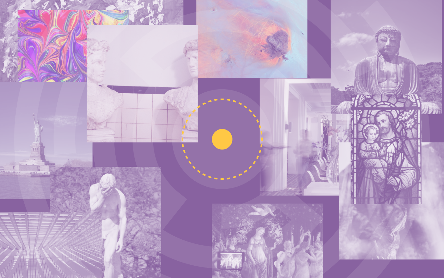
For example, we spend a lot of time researching which traditional values the people of a neighboring country value and are proud of, such as a flower, a temple, or a pattern. This happens when we receive a project to serve the native citizens of that country. Furthermore, our team has to observe whether they are already too “boring” with the current designs that have abused those images, etc., before proposing suitable directions.
All of the above processes help prepare a background knowledge about everything around, and you don’t have to be an expert or have an in-depth understanding of the field and the customer. You just need to know enough to feel it. The logo now, besides being a correct portrait (after step a), it will crystallize the value of the knowledge and reflect the specific and sophisticated things around the brand.
c. Improve association and combination skills
With the requirements of step a) and step b), we have somewhat built a thick material source for ourselves. The processing stage can somewhat begin.
Wait a minute… let’s prepare a little more carefully, who knows we can create further profound values?
With the input materials being information that has been filtered about the object that TELOS will “draw a brand portrait” of, we will blend in the background knowledge that has been nurtured. This process requires creative personnel with strong association and reflex skills, along with the practice of combining all information together.

For example, we can combine the customer’s personality with an animal they consider representative. We can also combine the initial character of the brand name with a symbol representing the industry they are in. The key is to create associations that are both common and unique when people hear the brand name.
After the preparation process, the team has taken steps to ensure that the branding process is:
- Accurate (step a)
- Reflective of the context surrounding the brand (step b);
- Creating a bridge (step c) to connect them and create value, which, in this case, is the value of “uniqueness.”
2. Let’s get creative
Step one is not about drawing, but about research. Although it may seem like a contradiction, we still need to analyze and evaluate.
The answer is that this research is more specific to the creative process, such as studying the industry’s trends and competitors, exploring different design styles, and exploring color palettes. This research helps the team generate fresh and unique ideas that are relevant to the brand and its values.
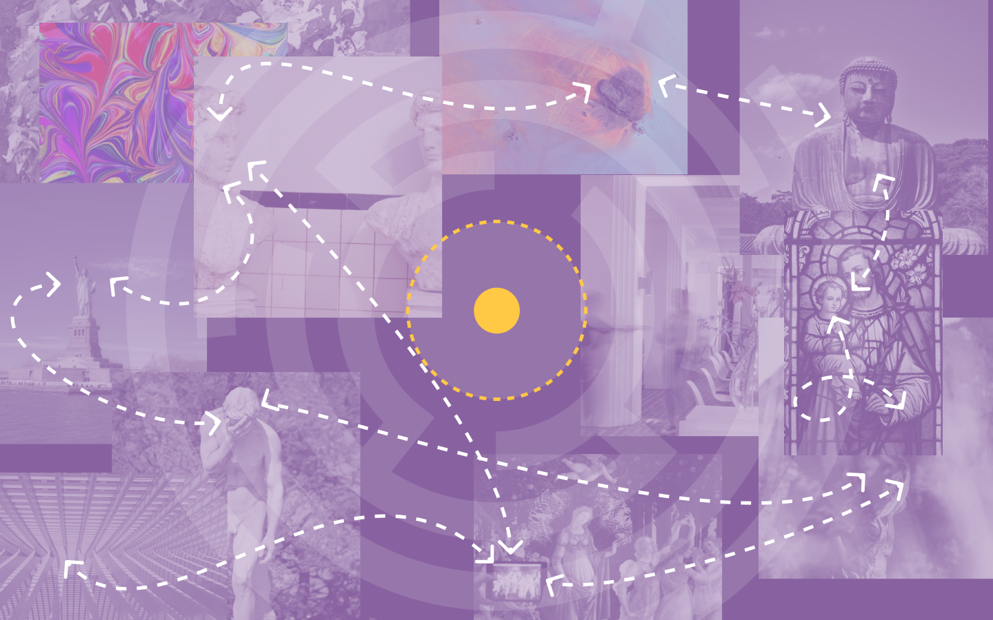
Yes, in the preparation process, we have collected all the necessary data and information. At this stage, we analyze and make conclusions based on the collected data, and also provide suggestions and examples of the expected outcomes. These will be compiled into a list or document to answer the question “what will customers receive after the project is completed?” We commonly refer to this as a “mood board” or “reference board”.
This helps to clearly define the expected outcomes of the project and also provides values for comparison.
Step two: Defining the brand identity
One of the easiest and most effective methods in creating a portrait of a brand is to personify its character as an individual.
Somewhere in a brand’s character lies various expressions of thought, vision, and how the brand interacts with its users and customers. So why not personify the brand as an individual to easily create connections and make the brand more real, authentic, and approachable? In this step, we sit down with the client to imagine the brand identity. For example:
- “Your brand will be a reliable, knowledgeable, and professional legal expert who desires to assist all customers with legal protection rights.”
- “Your brand will be a friendly food seller with a hearty and healthy family meal, with the nurturing personality of a mother or wife.”
- “Your brand will be a sophisticated real estate consultant with years of experience, meticulous and always striving for perfection.”

Building a brand as an image of a person also brings practical benefits:
- The brand and its personality traits will be consistent and specific.
- The brand will have a logical and authentic set of traits. What is not reasonable in the process of creating brand characteristics will gradually be revealed and can be adjusted accordingly.
- The brand will always have a clear direction about its “personality” to develop deeper standards to serve not only design but also content development, communication, and plans…
- The brand portrait is no longer difficult to imagine, draw, or direct.
The results mentioned above partly reflect enough information, tidiness, and conciseness for us to know what to express on our upcoming logo. Therefore, we move on to the next step…
Step three: Establishing direction and approach
What is listed in the brand personality in the previous steps helps us easily determine what to do next. Based on those characteristics, we begin to list out directions and options. There are many types of choices, but generally, these questions will be asked:
- Which brand personality/characteristics will be the top priority? Which personality traits will be supplementary factors?
- What message is being conveyed?
- Which representative symbols are associated with the brand’s desired message?
- What method of illustration or expression of the message will be used?
- What additional considerations and what needs to be avoided in the environment of this brand, industry, culture…
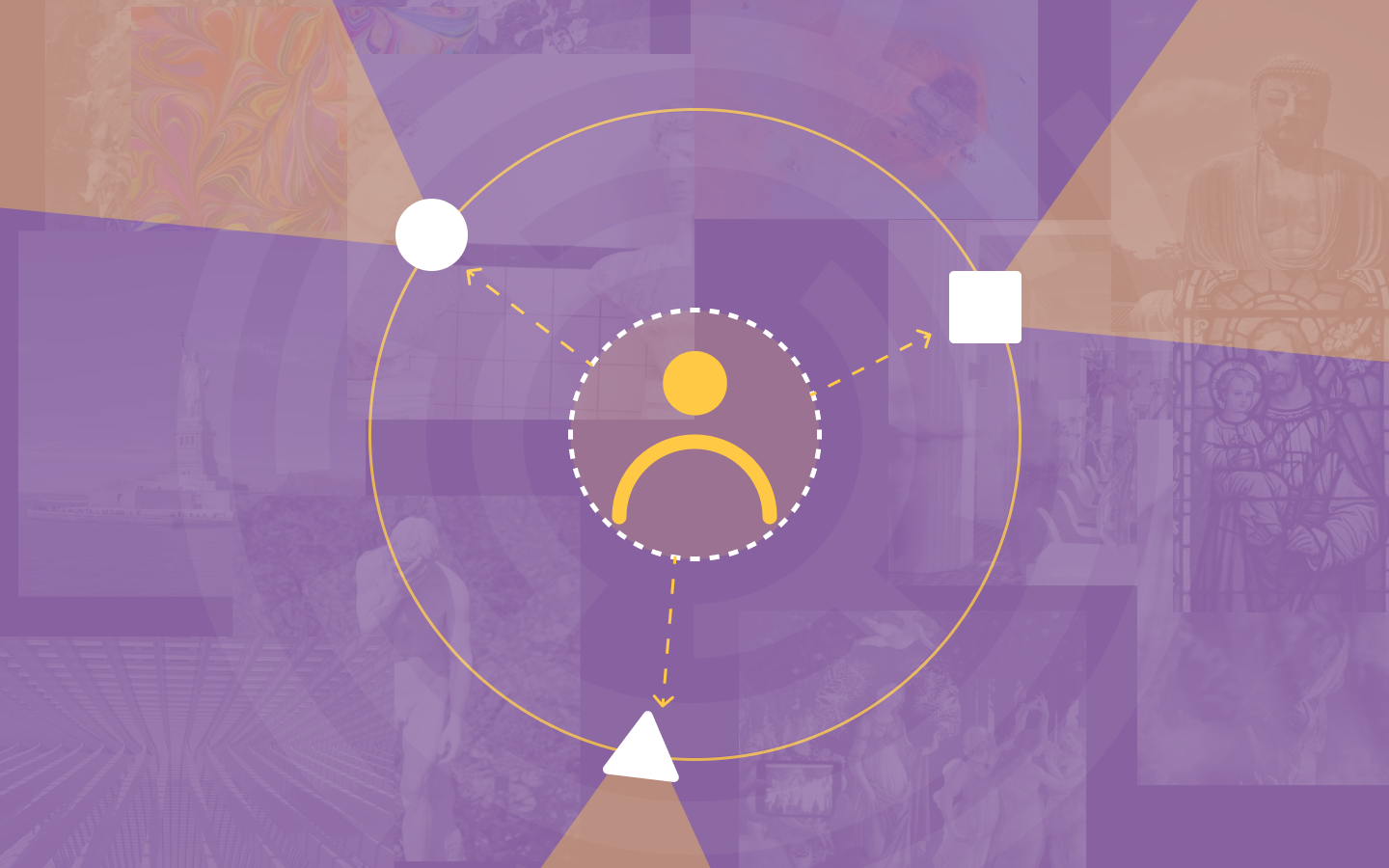
The combinations and choices mentioned above will give us options, directions, and potential for development that can be seen along these paths.
The value that this brings to customers is that they will have a clear understanding of which options may be applied, whether they are suitable, and the advantages of each option. In the TELOS design team, everyone also understands the materials, values that need to be conveyed, and the level of difficulty/ease in the upcoming creative process.
Now that everything is clear, we move on to realizing what we have been waiting for and bringing it to life.
Step four: Execution
In this process, we emphasize two main factors:
- Adhering to the sufficient preparation of raw materials through the mentioned steps to ensure that we are on the right path to convey the brand message.
- Expertise in design, art, and creativity to create unique and distinctive values and highlight the brand’s value.
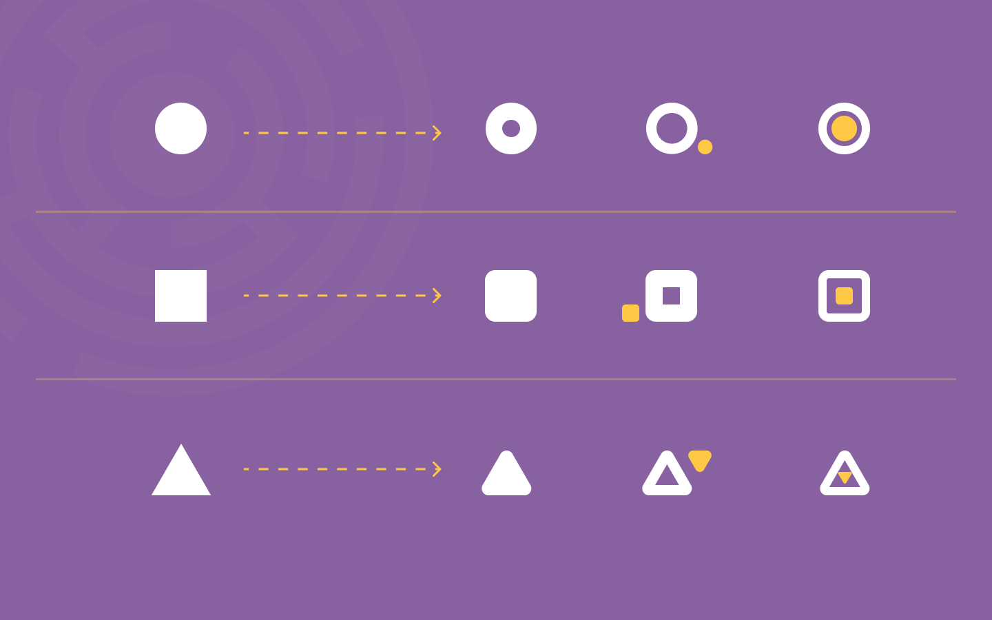
Therefore, to successfully execute this step, we need a professional and experienced team in the field of design and brand development. When designing, we must ensure that the analyzed and identified factors are incorporated into the design in a reasonable and appropriate manner. The result will be a unique and successful brand that is consistent with the brand’s values and message. Every direction has its own methods for creativity, but first, we need to respect the direction of the initial idea. What is right will come before what is beautiful.
There is always ample space for creativity. For each different project and specific client requirements, TELOS has methods to help the final design create specific values for the client.
And now we have formed plans, rough ideas waiting to be refined…
3. Criteria for evaluating a logo
Logo design always makes many clients feel unclear. Why does one seemingly beautiful logo cost 500k while another, much simpler-looking logo costs 50 million? Why do some companies trust creative agencies with complex steps and timelines in the months, while others only need to hire freelancers to create dozens of options in a few days? And what makes a good logo?
Here, TELOS uses the word “good” instead of “beautiful.” The purpose of a logo is to evoke the brand it represents. If the logo succeeds in doing that, it has fulfilled its purpose. Beauty, on the other hand, is not always the answer to every problem the brand faces. Furthermore, “beauty” is generally a vague criterion. Clients or even designers need clearer standards to evaluate.
Applicability
What new designers often fall into is excessive use of details. Details here can be the number of colors, shapes, fonts, design styles. This leads to a situation where the design in general and the logo, in particular, become cumbersome, vague, and unable to highlight anything outstanding.

One of the disadvantages of excessive detail in logo design is that it significantly limits the applicability of the logo. Your logo must be displayed in different sizes, materials, and environments. For example, if you own a fashion brand, your logo must be designed to look good on a billboard (large size) or on a clothing tag (small size). To achieve this, either your logo must have multiple versions in different sizes, or it must be very simple.
Even something as simple as color can cause difficulty in logo application if not understood properly. The color system used on computers is RGB, while the color system used in printing is CMYK, with different display methods. If a business focuses on printed products but uses bright blue or neon colors, the printed product will be dull and different from the design.
Currently, dynamic style in logo design is popular. This style can be understood as a logo with many different expressions while still maintaining recognition. Or there are many logos designed in eye-catching 3D style, focusing on digital environments rather than printing as before. However, whichever style is chosen, when designing a logo, the designer must consider the applications and usage cases to avoid the logo being difficult to use.
Recognition
Recognition is a requirement that goes hand in hand with the applicability of the logo. That is also the reason for the principle: the logo must be simple. Many clients prefer designs with high artistic value, logos with diverse colors, lines, and shapes but forget what the purpose of creating a logo is. The logo represents your brand. And you want customers to come to your brand as quickly as possible. So keep everything simple.
Recognition is also demonstrated through the ability for customers to recognize you among a sea of competitors. TELOS has mentioned in another article that you don’t have to be different from everyone, you just need to be different enough from your competitors.
For example, if you open a fashion store in a neighborhood full of fashion stores like Vo Van Tan in Saigon, would you want a black logo on a white background in a minimalist style? If it were me, I would not. There are already too many bright lights on a white background in this fashion neighborhood. I need a logo that is different enough for customers to remember me.
Brand personality
There are two common types of logo designs. Neutral logos focus on simple shapes and colors to optimize recognition. You can see this type of logo in many famous brands such as Nike, Pepsi, Starbucks… The logo here acts as a bridge between customers and the brand in the fastest way.

Therefore, when designing a logo, it is important to consider flexibility, which means that the logo should be able to adapt to different trends, environments, and usage cases. This does not mean that the logo should follow every trend that comes along, but rather that it should be able to evolve and adapt over time without losing its core identity.
Flexibility can be achieved through various means, such as designing the logo in vector format, which allows for easy resizing without loss of quality, or by creating multiple variations of the logo for different applications. Another way to ensure flexibility is to focus on the core elements of the logo, such as the typography, color scheme, and shapes, rather than on trendy design elements that may quickly become outdated.
In conclusion, when designing a logo, it is important to consider its applicability, recognition, emotional appeal, and flexibility. By focusing on these key aspects, you can create a logo that effectively represents your brand and can adapt to different environments and trends over time.
Flexibility
The question here is how flexible you want your logo to be. With a high level of flexibility, the logo must be able to adapt to changes in size, material, and can have multiple versions added. However, if that’s the case, your logo should be simple for easy customization. This is a trade-off: if you want a flexible logo that can change according to your needs, it must be simple. Conversely, if you want to maintain the unique characteristics of your logo, you may have to accept that in some cases, the logo may become less effective.

When you come to TELOS, our design team will research and provide you with the most accurate advice based on your needs. Moreover, we can supplement missing information to evaluate the most essential usage cases to determine the level of flexibility your logo needs. As mentioned above, flexibility must be balanced with the simplicity of the logo.
Message
This is the final criterion you want to convey when evaluating a logo. A logo is not like a slogan. A logo is just a small image that marks your brand. Many customers want the logo to be the face of the brand, but that is not entirely true. A logo is like a tattoo on your arm. When you look at the tattoo, you will remember the milestones of yourself. But first, you must have memories. A beautiful tattoo cannot create a memorable story, just like a perfect logo cannot create a message for your brand. The message or story must come first.
Overloading the logo with too many tasks can make it too complex, affect recognition, and reduce flexibility. Therefore, you should consider carefully if you want to express anything on the logo. Remember, the logo is not everything your brand needs.
4. Completion and Conclusion
This will be discussed in more detail in the next part of this process, which TELOS is eager to share with you soon.
Please wait for it because it is worth it. :>
